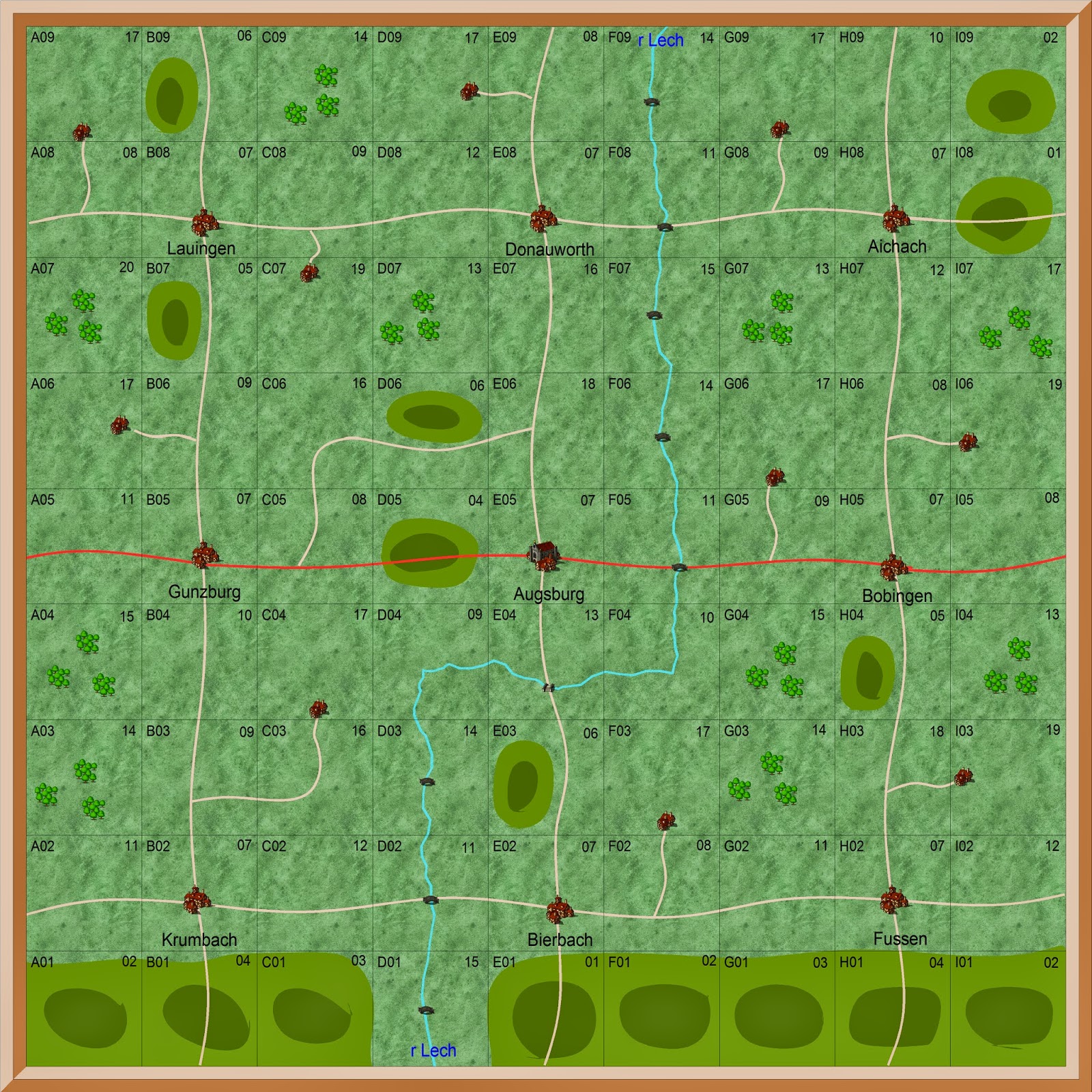
Tactical Map for Augsburg Phase of the new campaign
I spent a lot of time this week working on different options
for the tactical map. I wanted to
design a completely new map, which looked more like a normal map rather than a
map board.
I tried out three different options, but none of them
worked. They looked much better, but
they created more problems trying to convert them to the wargames table. Given that the object of the campaign is to
provide good wargames, and that I also want to reduce the amount of work I have
to put in, that would be very counter productive.
So I have gone back to the same layout I use now. It works so well that none of the other
three options worked as well.
One of the options I looked at was to have the map wider and
deeper. But all that did was make them
harder to read on the campaign diary blog.
And they also allowed the players to hide from each other more, or
simply lose the other side completely.
So most of the work this week has been wasted. Though at least I have proved to my own satisfaction that the
current map provides the best answer.

No comments:
Post a Comment
I have set the settings for comments to come to me before posting so that I will not miss any